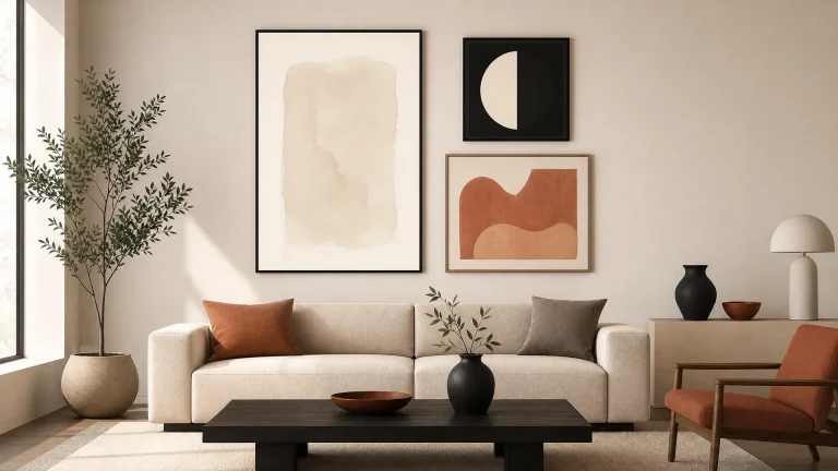
A gallery wall should feel like a collected story, not a scattered pile of memories. Stand back and look at your living room or hallway: the arrangement should guide your eye gently across the display, not send it darting between competing focal points. Getting that sense of calm takes intention before you ever pick up a drill. The difference between chaos and curation usually comes down to planning, not perfection.
This guide is for anyone who wants their home to feel personal and put-together without hiring a professional installer. It won’t promise that every eclectic mix works effortlessly, some combinations clash no matter how you space them, but it gives you a reliable way to test ideas before they’re permanent. You can build a balanced gallery wall that reflects who you are while keeping the visual order that makes a room feel restful.
Defining Balance in Gallery Wall Design
Balance in interior design comes down to how heavy an object feels to the eye, not what it weighs on a scale. A small, dark-framed photograph with high contrast can pull more attention than a large, pale watercolour. That means you need to spread these visual anchors carefully so one side of your wall doesn’t feel lopsided. Interior designers consistently recommend treating the gallery wall as a single composite artwork rather than individual pieces, using an imaginary bounding box to hold the whole thing in balance.
Visual Weight vs. Physical Size
Your eye goes to darkness, saturation, and detail before it notices something larger but lighter. Place your heaviest visual pieces near the centre or bottom of your arrangement to ground the composition, then let lighter works radiate outward for a sense of expansion. This stops the display from looking top-heavy, and it lets even an asymmetrical layout feel deliberately anchored in the room.
Symmetrical vs. Organic Arrangements
Grid layouts offer immediate order and suit formal spaces where you want to reinforce architectural lines. Organic salon-style clusters give you more room to mix eras and mediums so the wall feels lived-in rather than staged for a museum. Choose whichever approach matches the energy of the room: a rigid grid in a cosy reading nook can feel sterile, while a loose cluster in a minimalist dining area might read as clutter.
Choosing a Cohesive Colour and Frame Palette
Restriction creates freedom when you’re trying to unify artworks that don’t naturally match. Limit your selection to two or three dominant tones and the eye gets a path to follow, instead of a wall that fights with your furniture. You deserve a display that complements your life, not one that demands constant visual negotiation.
Limiting Your Tonal Range
Pick a primary colour family that echoes your existing soft furnishings or rug, then add one accent tone for contrast and one neutral for breathing room. Black-and-white photography pairs well with sepia prints if both share similar contrast levels. Vibrant botanicals can sit next to abstract art if they pull from the same saturated hue. This tonal threading works like an invisible grid, holding the collection together even when frame styles and subjects vary widely.
Mixing Frame Styles Intentionally
Uniform frames create rhythm and safety. Mixing materials adds the layered warmth that makes a house feel like a home. Pair sleek black aluminium with warm oak or vintage gold, but repeat each material at least twice so the variation reads as a pattern, not an accident. That repetition tells the viewer every choice was considered, it’s what turns a potential mismatch into sophisticated eclecticism.
Planning Layouts Before Making Holes
The most reliable way to plan a gallery wall before drilling is to make full-scale paper templates of every frame. Cut shapes from newspaper or builder’s paper to match your exact dimensions, then tape them to the wall to test spacing and sightlines without any permanent damage. This rehearsal lets you step back and judge proportions in real time, adjusting by centimetres until the arrangement feels right.
Paper Template Method
Mark the hook position on each paper cutout so you know exactly where the nail goes once you remove the template. Use painter’s tape rather than masking tape to avoid peeling paint, and leave the templates up for at least twenty-four hours to see how natural light moves across the composition through the day. That patience saves you from misplaced holes later.
Floor Staging Techniques
Lay your actual frames on the floor in front of the intended wall and experiment with grouping and negative space in natural daylight. Rearrange pieces freely, with no pressure from adhesive or nails, and photograph each version from above to compare them on your phone screen. Floor staging reveals relationships between artworks that stay hidden when you’re only looking at the vertical plane, it helps you work out which pieces truly belong together before anything leaves the ground.
Spacing and Alignment Rules for Clarity
Consistency in the gaps between frames creates a subconscious sense of order that makes even an eclectic collection feel intentional. A common formula uses 5-7cm spacing between frames in grid layouts, while organic clusters typically keep 8-12cm gaps for breathing room. Treat these as starting points rather than laws, but stick to a fixed interval, that’s what stops curation drifting into clutter.
Consistent Gaps Between Frames
Measure your chosen gap once, then carry that exact distance to every junction in the arrangement using a spacer block or marked ruler. Irregular spacing forces the eye to recalibrate constantly, and that fatigue undercuts the emotional impact of the art itself. Uniform negative space works like a silent frame around each piece, giving every image its due while reinforcing the unity of the whole.
Aligning to a Central Axis or Sightline
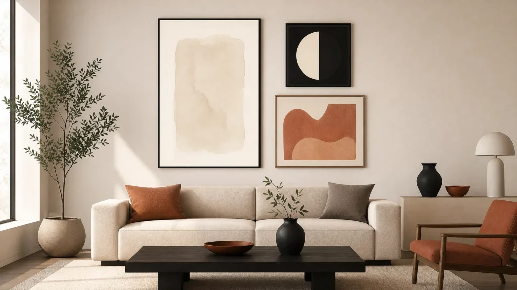
Anchor the whole composition to a horizontal line at average eye level, roughly 145-152cm from the floor to the centre of the arrangement. Gallery walls hung at this height are perceived as significantly more balanced than ones hung arbitrarily higher. If you’re hanging above furniture, align the bottom edges of your lowest frames to create a strong baseline connecting the art to the sizing art above key furniture pieces beneath it.
Integrating Mirrors and Textural Elements
A gallery wall made entirely of flat prints can feel static. Introduce a reflective surface and it breaks the plane, pulling light deeper into the composition. Mirrors act as active participants in the display, they multiply light, shift spatial perception, and give the eye relief from dense imagery. In our own styling work, we’ve found that anchoring gallery walls to existing furniture, like sideboards or couches, creates immediate cohesion in South African living rooms.
Using Reflective Surfaces as Visual Anchors
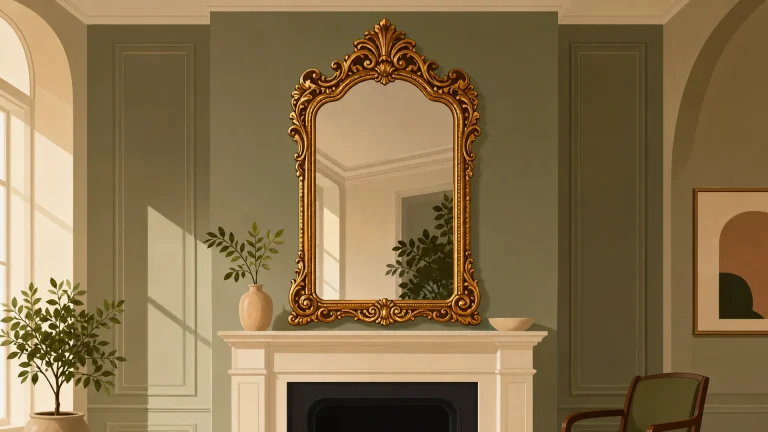
Position an ornate or oversized mirror near the centre of your arrangement so it grounds the artworks around it. Learn more about styling ornate mirrors within gallery arrangements to see how gilded frames and bevelled edges interact with matte prints. The mirror’s reflection changes through the day, so the wall never feels frozen in one state.
Adding Depth with Non-Art Objects
Add floating shelves, woven textiles, or ceramic vessels for the shadow and dimension flat art can’t give you alone. Explore guidance on choosing mirror shapes for visual variety to see how circular silhouettes soften rectangular grids and add sculptural interest. These three-dimensional pieces break up the monotony of framed rectangles, and they’re what makes a wall feel inhabited rather than installed.
Adapting Gallery Walls for South African Homes
Our natural light is generous, and that’s both a gift and a challenge when you’re displaying art, you need a placement strategy that makes the most of it without sacrificing visibility. Direct afternoon sun can bleach pigments and throw glare that makes a photograph unreadable, so keep sensitive pieces away from western windows or use UV-filtering glass. Understanding using mirrors to enhance spatial perception helps you use that brightness on purpose instead of fighting it.
Considering Local Light Conditions
Test your paper templates at different times of day so you can see when glare obscures a piece or shadow swallows another. Position mirrors to bounce morning light into darker corners, and keep your most valuable artworks in spots that get consistent, indirect light. This means your gallery wall looks good all day, not just in one brief window of perfect light.
Scaling for High Ceilings and Open Plans
Modern South African homes often have expansive walls that dwarf a standard-sized arrangement, which calls for bolder scaling to avoid a postage-stamp effect. Group smaller pieces into tight clusters that read as a single mass from a distance, or use fewer, larger works that can hold their own against generous proportions. Open-plan spaces get viewed from multiple angles, so check that your composition still holds together whether you’re looking from the kitchen island or the lounge sofa.
Common Mistakes That Create Chaos
Hanging art too high is the most common error, it puts pieces in the ceiling zone, disconnected from human scale and the furniture below. Ignore the relationship between your gallery wall and the furniture near it, and you end up with a floating island of decor that has no context in the room. Editing décor for calm, intentional spaces often means accepting that removing one beloved piece strengthens the whole arrangement.
Rushing to hang without templates leads to crooked lines and holes you’ll regret. Skip consistent spacing and thoughtful curation drifts into accidental clutter, no matter how good the individual artworks are. The most serene gallery walls are always the result of patience, not impulse.