Choosing the right canvas art turns a room from merely furnished into somewhere you actually want to be, yet plenty of South African homeowners hesitate at the final step because they’re unsure about scale. You might have found a piece you love, but without knowing how wide it should be relative to your couch or headboard, even beautiful work can look lost on a big wall or squashed above a substantial sofa. Getting this proportion right anchors your space and gives it that sense of calm that makes a house feel like home.
This guide takes the guesswork out of it, so you can choose art with confidence instead of anxiety. We’ll walk through specific measurements for the furniture sizes common in Gauteng homes, so your new canvas sits with your existing pieces the way it should.
The Golden Ratio for Hanging Art Above Furniture
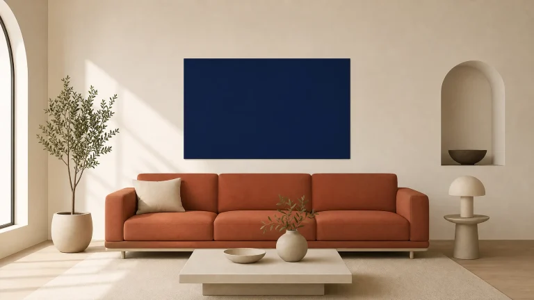
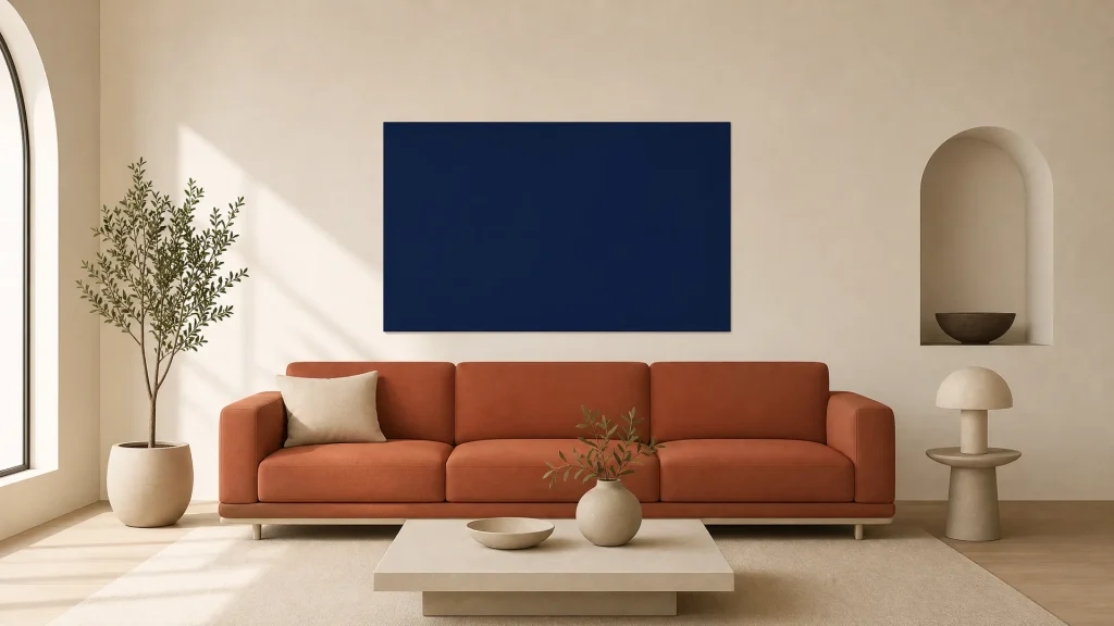
Interior design standards consistently recommend that wall art above furniture cover roughly 66% to 75% of the furniture’s width. That’s the sweet spot for visual weight, wide enough to feel connected to the piece below it, without competing for dominance or looking insignificant against a large backdrop.
Why the Two-Thirds Rule Works Visually
The eye naturally seeks balance when it scans a room. The two-thirds rule satisfies that by creating a stable visual triangle: when canvas art spans roughly 70% of the sofa width, it forms an invisible shape with the furniture’s outer edges that guides the gaze across the arrangement instead of letting it drift toward empty corners.
You’ll notice immediately when this ratio is off, because the art either floats disconnected from the sofa or presses down too heavily on the seating below it. Getting the ratio right matters most in open-plan living areas, where sightlines are long and there’s nothing to break up an awkward gap.
Adjusting Proportions for High Ceilings
Modern South African architecture often features ceilings above 2.7 metres, which can make standard-sized art feel dwarfed even when the width ratio is technically correct. In these taller spaces, push toward the upper end of the 75% range, or increase the canvas height to hold its presence without widening past the safe proportional boundary.
Consider stacking two smaller canvases vertically if a single wide piece would break the width rule while still looking too short for the wall height. This keeps the horizontal relationship to your furniture intact while acknowledging the room’s vertical volume, so the composition stays grounded rather than drifting toward the ceiling.
Sizing Canvas Art for Different Couch Configurations
Your sofa’s footprint dictates the canvas dimensions far more than the wall size does, because the art needs to relate to the furniture, not the room. For a 220cm wide three-seater sofa, common in South African homes, a single canvas or combined gallery arrangement should measure between 145cm and 165cm wide to sit inside that ideal proportional zone.
Standard Three-Seater Sofas
A typical three-seater in Gauteng ranges from 200cm to 240cm, which means the 145cm to 165cm canvas range fits most living rooms you’ll come across. If your sofa sits at the narrower end, aim for a 130cm to 140cm canvas to avoid overhang. Wider models can take pieces up to 180cm without losing cohesion.
Remember that styling scatter cushions for your sofa adds visual bulk at the ends, so your furniture’s effective width extends slightly beyond the frame itself. Account for that when measuring, especially with oversized cushions that push the visual boundary out by several centimetres on each side.
L-Shaped and Sectional Layouts
L-shaped sofas are trickier, because treating the entire length as one unit gives you impossibly wide art that dominates the room. Place your canvas above the main seating section, the longer straight run, and ignore the chaise or corner extension when you calculate width ratios.
Alternatively, treat the L-shape as two separate zones with distinct artworks if both sections face different directions or serve different functions in an open-plan layout. This keeps each seating area scaled to its own focal point, rather than forcing one oversized piece to serve two orientations at once.
Compact Two-Seater Options
Smaller loveseats and two-seaters typically span 150cm to 180cm, which calls for canvas widths between 100cm and 130cm to stay within the golden ratio. These compact pieces do better with art that leans toward the 75% mark rather than 66%, since narrower furniture can make correctly sized art look even smaller by contrast.
Don’t hang an oversized statement piece above a petite sofa hoping to make the furniture feel more substantial. It only highlights how small the sofa is and makes the ceiling feel lower, whereas properly scaled art actually lifts the perceived quality of compact furnishings.
Headboard Art Placement and Bedroom Balance
Bedroom art serves a different purpose than living room pieces. It’s about calm and symmetry, not dynamic energy or conversation-starting impact. Your headboard is the anchor here, just as a sofa is downstairs, but the sizing has to account for the bed’s role as a place of rest, where visual agitation gets in the way of sleep.
Queen vs King Bed Proportions
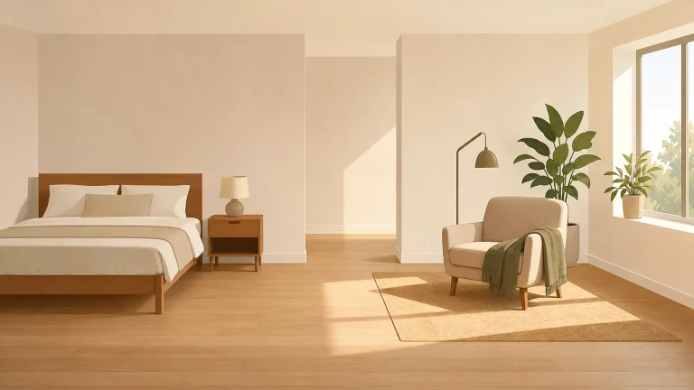
A queen bed headboard typically measures 150cm to 160cm wide, which calls for canvas art between 100cm and 120cm to hold the two-thirds relationship without extending past the mattress edges. King beds expand to 180cm or more, opening the door to panoramic canvases spanning 130cm to 150cm, or symmetrical triptychs that fill the same proportional band collectively.
Wider beds often need either a single panoramic canvas or a symmetrical triptych to keep things balanced, since asymmetry above a king-size bed reads as unintentional rather than artistic. Bedrooms demand that formal balance in a way living rooms don’t, where an off-centre arrangement can feel deliberately relaxed.
Working with Tall Upholstered Headboards
Tall upholstered headboards shrink the wall space between the top of the bed and the ceiling, which compresses the zone where art can live comfortably. Measure from the headboard’s highest point to the ceiling first. If less than 90cm remains, go for landscape-oriented canvases with modest height rather than forcing a tall piece into a gap that can’t take it.
Headboard height affects the vertical spacing directly, a 120cm-tall headboard under a 2.4m ceiling leaves barely enough room for a 40cm-tall canvas plus proper gaps above and below. In these tight situations, consider mounting sconces or reading lights beside the headboard instead, so the room keeps its sense of space and stays restful.
Vertical Spacing: Gap Between Furniture and Frame
The distance between your furniture’s top edge and the bottom of the canvas matters as much as width. This gap decides whether the art reads as part of a unified grouping or as something unrelated floating nearby. Keep a consistent gap of 15cm to 25cm, with lower ceilings warranting the tighter 15cm to keep things compact and intentional.
Art placed more than 30cm above a sofa back loses its relationship to the furniture and starts to look like it belongs to the ceiling rather than the seating area. This is one of the most common reasons professionally selected art still feels wrong in a room, and fixing it often takes nothing more than lowering the frame by five or ten centimetres.
Always measure this gap from the furniture’s highest point, including cushion backs or throws that add height beyond the frame itself. Keeping this measurement consistent is what connects the art to the furniture instead of letting it float, which is why we use similar logic in our guide to mirror placement above sideboards for dining and hallway spaces.
Single Statement Pieces Versus Gallery Walls
Whether you go with one dominant canvas or several smaller frames depends on your room’s existing complexity and the mood you’re after. A single piece suits minimalist interiors, where clean lines and uncluttered surfaces call for one focal point. A gallery adds texture and narrative depth to eclectic spaces that already embrace layered visual interest.
When One Large Canvas Is Enough
A single oversized canvas delivers impact immediately and simplifies the decision, since there’s no need to coordinate multiple frames, mat colours, and image themes. It works best when your sofa or headboard has clean lines and minimal detailing, letting the art carry the decorative weight without competing against ornate furniture.
Choose this route if you’re prioritising key furniture pieces in a new home and want one anchoring element that sets the room’s colour palette and mood right away. A well-chosen statement piece can define the space before the rest of the furniture even arrives.
Creating Cohesion with Multiple Frames
Gallery walls let you reach the required total width through accumulation rather than hunting for one perfectly sized canvas, which helps when budget or availability limits your single-piece options. Treat the whole gallery arrangement as one unit when you measure width, making sure the outermost frames still respect the two-thirds furniture rule.
Keep consistent spacing between individual frames, typically 5cm to 8cm, to reinforce the sense of one composition rather than scattered objects. Varying the frame sizes within the gallery adds dynamism, but the overall silhouette still needs to read as a single rectangular mass that relates cleanly to the furniture below it.
Common Sizing Mistakes That Disrupt Room Flow
Hanging art too high is the most frequent error we see in South African homes, often a holdover from museum-style hanging conventions that ignore the furniture relationship entirely. Choosing art narrower than half the furniture width is the other common failure, and it makes ceilings feel lower and rooms feel unbalanced even when the vertical placement is spot on.
Both mistakes are entirely reversible, and fixing them is often more transformative than buying new furniture. Before you invest in replacement pieces, try repositioning what you already own, or add a temporary paper template to test whether proportion alone is the issue.
Not every beloved piece will suit every furniture configuration. Recognising that early saves you both money and the disappointment of forcing a mismatch that no amount of styling can fix.
Measuring Your Space Before You Buy
We find that customers who use painter’s tape to mock up canvas dimensions before ordering report significantly higher satisfaction with their final room layout. The step takes less than fifteen minutes and cuts out the uncertainty that leads to returns, exchanges, or a purchase you’re never quite happy with.
Start by marking the furniture’s width boundaries on the wall with low-tack tape, then work out 66% and 75% of that measurement and mark those points as your acceptable range. Step back to eye level and check whether the taped rectangle feels balanced against the furniture below, adjusting within the range until it feels instinctively right for your ceiling height and light.
Test different widths at different times of day, since shadows change how large something looks. A canvas that looks perfect at noon may feel overwhelming under warm evening lamplight, or the other way round.
With your measurements confirmed and your painter’s tape template checked, you can explore Furnicare’s curated canvas art range knowing exactly which dimensions will work in your home. Measure your existing furniture today, trust the proportions here, and choose artwork that makes your home feel unmistakably yours.