Creating a bedroom that feels collected rather than catalogued means stepping away from the safety of pre-packaged suites. When you choose pedestals and headboards that complement each other without matching exactly, you’re building something warmer than a formula. The look relies on visual relationships and shared character, not identical finishes, and it lets your own taste come through in the interplay of texture, tone and form. It’s also practical. South African homes evolve, and furniture needs change with them, so a bedroom built on relationships rather than a fixed set can grow with you.
Why Mismatched Bedroom Furniture Feels More Intentional
A perfectly matched bedroom suite often lacks the layered depth that makes a room feel truly lived-in. Curated bedrooms lean on visual relationships instead, letting each piece hold its own story while still belonging to the whole. Interior designers consistently recommend anchoring mixed furniture through repeated undertones or silhouettes rather than identical stains. That’s what creates harmony without monotony. Once you stop chasing an exact match, you’re free to trust what actually looks right to you.
Moving Beyond the Showroom Set
Retailers have long sold coordinated sets because they make the decision easy. But real style comes from trusting your eye over convenience. Mixing pieces gives you room to grow into a family heirloom or a vintage find that doesn’t match your existing bed frame, and it turns your bedroom from a temporary showroom display into something that’s actually yours. A solid kiaat pedestal paired with an oak-framed headboard works when both share warm honey undertones and similar mid-century, clean lines. Connection matters more than uniformity.
Establishing Visual Balance Between Bedside Tables and Headboards
Scale is the quiet thing that decides whether mismatched pieces read as a deliberate composition or a pile of leftovers. Weigh the visual mass of your headboard against your pedestals so neither one disappears or takes over. Get the proportions right and the room stays anchored instead of feeling top-heavy.
Proportion and Scale Guidelines
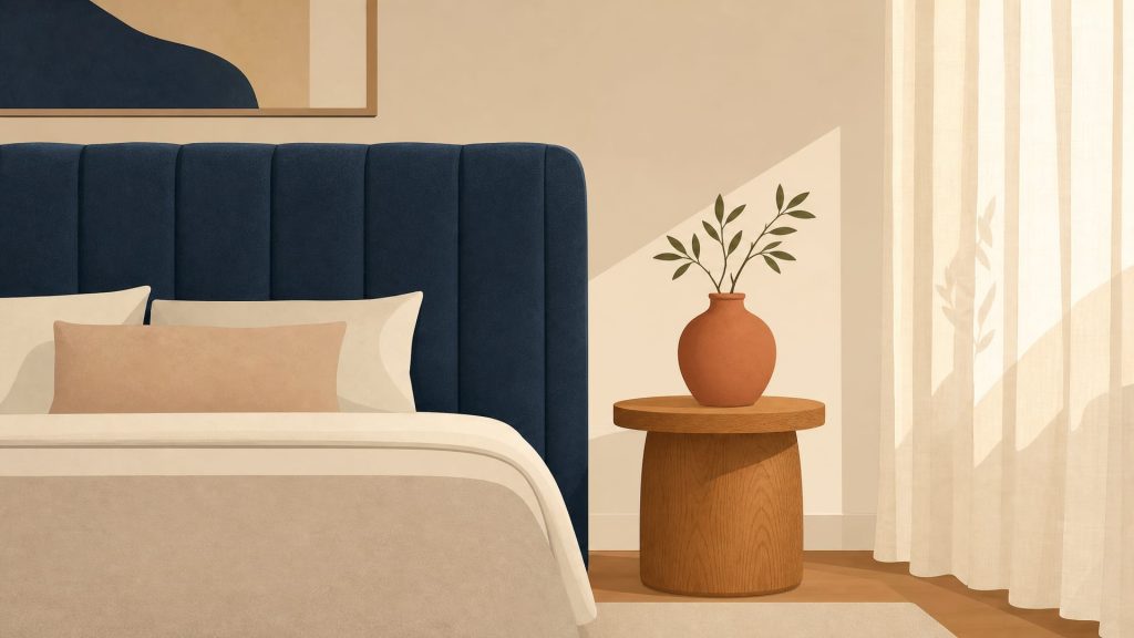
Think of the relationship between pedestal size and headboard size as a matter of visual weight, not strict ratios. A substantial upholstered king-size headboard wants wider or visually heavier bedside tables to ground it. A slender wrought-iron frame, on the other hand, pairs better with delicate, open-shelf pedestals that don’t crowd its airiness. If your headboard runs well beyond the mattress width, your pedestals can sit slightly narrower without looking lost, but if the headboard is flush with the mattress, wider tables help extend the line and hold things steady. Avoid setting two spindly tables beside a massive timber headboard. The contrast makes the bed look heavy and the tables look like an afterthought.
Aligning Heights for Comfort and Symmetry
Function has to drive your height choices, because a beautiful bedside table is no use if you can’t reach your water glass at night. Bedside tables typically work best when their surface sits level with, or just above, the top of the mattress, so you’re not groping downward in the dark. Measure from the floor to the top of your mattress before you shop. Base heights and mattress depths shift this number more than people expect. Perfect symmetry isn’t necessary when you’re mixing styles, but a big height gap between left and right pedestals can throw off the balance unless something else, a lamp or a piece of wall art, evens it out.
Mixing Wood Tones and Textures Confidently
Combining different timber species adds richness and keeps a room from going flat, but it asks you to pay attention to colour temperature. Understanding timber undertones is what separates a sophisticated mix from a clash that never quite resolves. You want the woods talking to each other, not competing, which means looking past the surface stain to the warm, cool or neutral base note underneath.
Pairing Warm and Cool Timber Undertones
Different wood tones combine well once you respect undertone families. Warm woods like kiaat, cherry and traditional mahogany carry red or orange bases that glow in natural light. Cool woods like ash, white oak and grey-washed timbers lean blue or green. Staying within one temperature family is the safest route if you’re new to this: warm-with-warm or cool-with-cool harmonises naturally even when the grain patterns differ. If you do want to cross the line, bring in a bridging element, a rug or a wall colour that carries both undertones, to soften the transition.
Using Grain and Finish as Connectors
Texture and sheen often matter more than colour for tying disparate pieces together. A matte-oiled oak pedestal and a satin-finished walnut headboard sit well together because their low-sheen surfaces catch light in similar ways, even with a colour difference between them. A high-gloss lacquered table next to a raw, textured timber headboard, though, creates friction that reads as unintentional unless you’re deliberately going for high-contrast eclecticism. Grain matters too: tight-grained timbers like maple pair easily with each other, while open-grained species like ash or rough-sawn pine need careful balancing against smoother surfaces so the room doesn’t feel busy.
Creating Cohesion Through Shared Design Elements
When pieces don’t match in material or colour, shared design elements do the work of tying the room together. These small repetitions act like threads, reassuring the eye that the combination was chosen on purpose. You build that unity through echoes of form, line and detail, small enough to sit below conscious notice but strong enough to register as harmony.
Repeating Shapes and Silhouettes
Echoing a curve, a line or a joinery detail creates a quiet harmony between pieces that might otherwise feel disconnected. A headboard with soft, rounded corners pairs naturally with pedestals that have curved edges or circular drawer pulls, even if one is upholstered linen and the other solid timber. Angular, geometric headboards ask for bedside tables with crisp lines and structured forms to keep the room consistent. If you’re drawn to softer aesthetics, country-style bedroom foundations show how arched headboards and turned-leg pedestals share a romantic silhouette that unifies them despite any difference in material.
Linking Hardware and Detailing
Consistent metal accents or carving styles work as quiet unifying threads without requiring matching wood tones. Brushed brass drawer handles on a modern oak pedestal and a vintage mahogany chest create an immediate link that overrides their different ages and finishes. Decorative mouldings, fluting or reeding on both the headboard and bedside pieces build a shared craftsmanship vocabulary that crosses material lines. Even the absence of hardware can connect pieces: push-open drawers on both create a handle-free look that reads as cohesive minimalism no matter what the timber is.
Using Colour and Upholstery to Bridge Different Pieces
Textiles and wall colour unify mismatched bedroom furniture by acting as a neutral go-between for contrasting wooden tones or styles. Soft furnishings absorb the visual tension and give diverse pieces room to coexist instead of competing for attention. Layering textiles for cohesion through bedding, throws and curtains builds a colour field that wraps around the furniture, so differences read as variation rather than discord.
Upholstered headboards make especially good bridges, because fabric softens the transition between contrasting wood tones on its own. A linen-upholstered headboard in a warm greige can sit between a dark walnut pedestal and a light ash table, picking up undertones from both while adding a third, mediating colour. Wall paint does the same job on a bigger scale. Choose a shade that relates to both wood tones and the whole scheme feels grounded, with neither piece left looking isolated. Patterned scatter cushions or a textured throw can pull in several colours from your mixed palette, stitching the pieces together visually.
Practical Considerations for South African Bedrooms
Gauteng’s climate is tough on mixed-material bedrooms. Dry winters and humid summers make timber expand and contract through the year. Protecting mixed timber pieces from sun damage and humidity swings keeps your combination ageing together instead of at different rates. It’s worth choosing materials with these conditions in mind, since that’s what preserves both the look and the structure over decades.
Durability and Maintenance in Local Climates
South Africa’s climate shapes material choices for mixed bedroom sets, because different woods respond differently to our seasonal extremes. Dense, stable timbers like kiaat and stinkwood handle Gauteng’s humidity swings better than softer, more porous species, which can warp or crack over time. UV from our highveld sun fades timber unevenly, so keep darker woods away from direct windows, otherwise one piece bleaches faster than its partner and the balance you built starts to slip. Regular oiling or waxing keeps moisture levels even across pieces, so they age at similar rates and stay in step with each other.
Sourcing Versatile Pieces Locally
Furnicare’s curated range includes a variety of timber options chosen to complement each other across collections, so mixing stays easy. Choosing quality local timbers supports sustainable forestry and means the materials are already acclimatised to South African conditions before they reach your home. Locally crafted pieces often use construction suited to our environment, floating panels and proper sealing that accommodate movement without compromising the look. Investing in versatile, well-made furniture means you replace less often, and your bedroom can evolve as your taste does.
Common Pairing Mistakes to Avoid
Successful mixing needs restraint and a clear anchor point. Add too many variables without a unifying strategy and you get chaos, not curation. The most common error is ignoring undertone compatibility: warm orange-toned woods clash hard with cool grey-toned timbers even at similar darkness levels. Extreme scale mismatches disrupt the calm too, a tiny pedestal beside an oversized headboard looks dwarfed, while a bulky table overwhelms a delicate frame. And when both the headboard and pedestals carry bold carvings, bright colours or ornate hardware, you get two focal points fighting for attention instead of one calm room.
This approach isn’t for everyone. If identical matching brings you peace of mind, forcing a mix will only bring discomfort, not joy. True complementarity comes from editing ruthlessly, so that every piece earns its place through relationship, not just presence.